I’m Ben Dunkle. I go by @empireoflight on Twitter and WordPress.org. I’m @dmaprof on Instagram.
I’m a professor in the Digital Media Arts program at Canisius University. When I’m not teaching, I contribute to WordPress, make plugins, organize community events centered around WordPress, make art, fonts, icons, and WordPress plugins. I build websites and other stuff as Field 2 Design.
Occasionally, I post content here.
Posts
-
Testing out WP 6.5
Hoping to find:
-
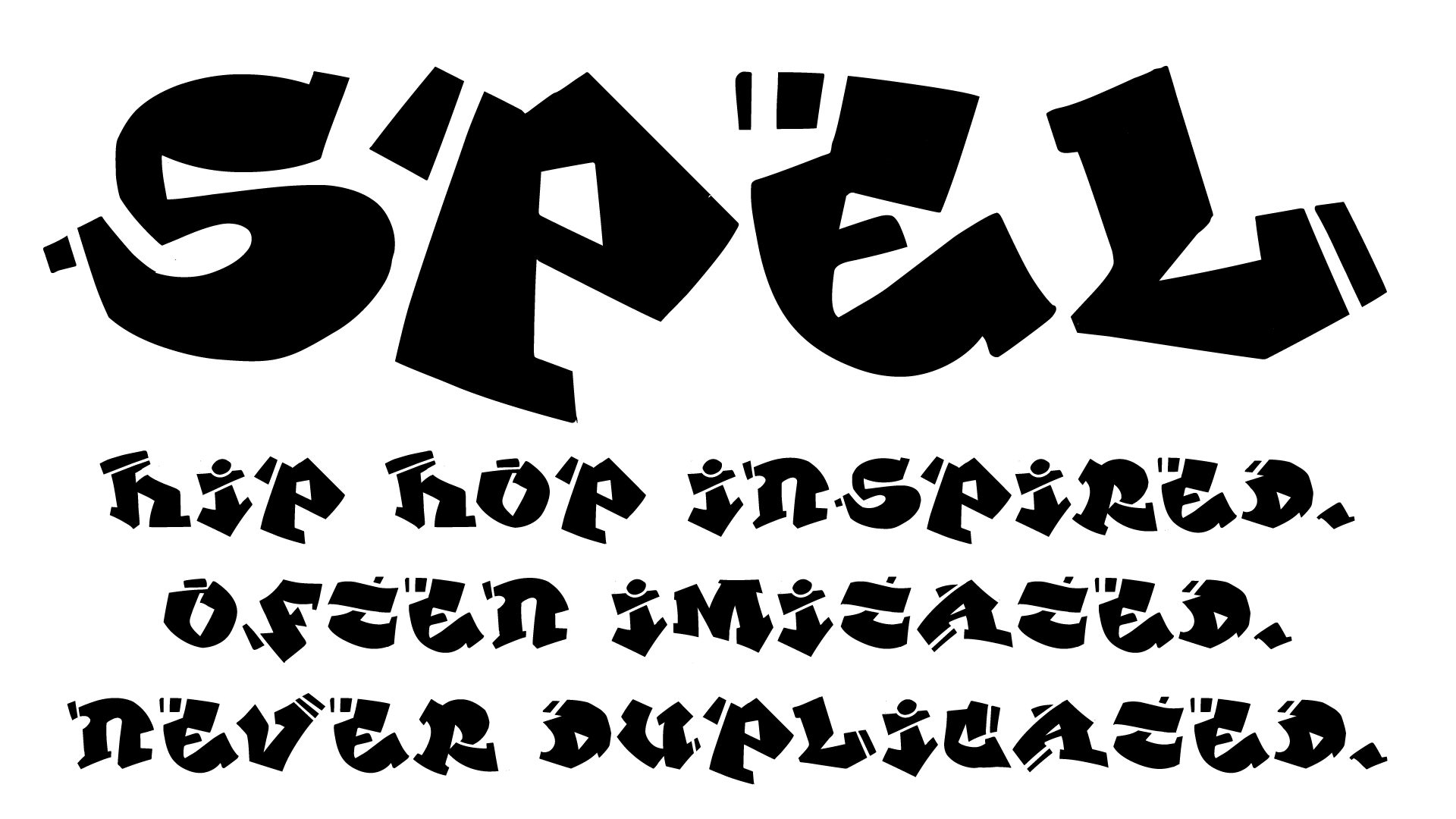
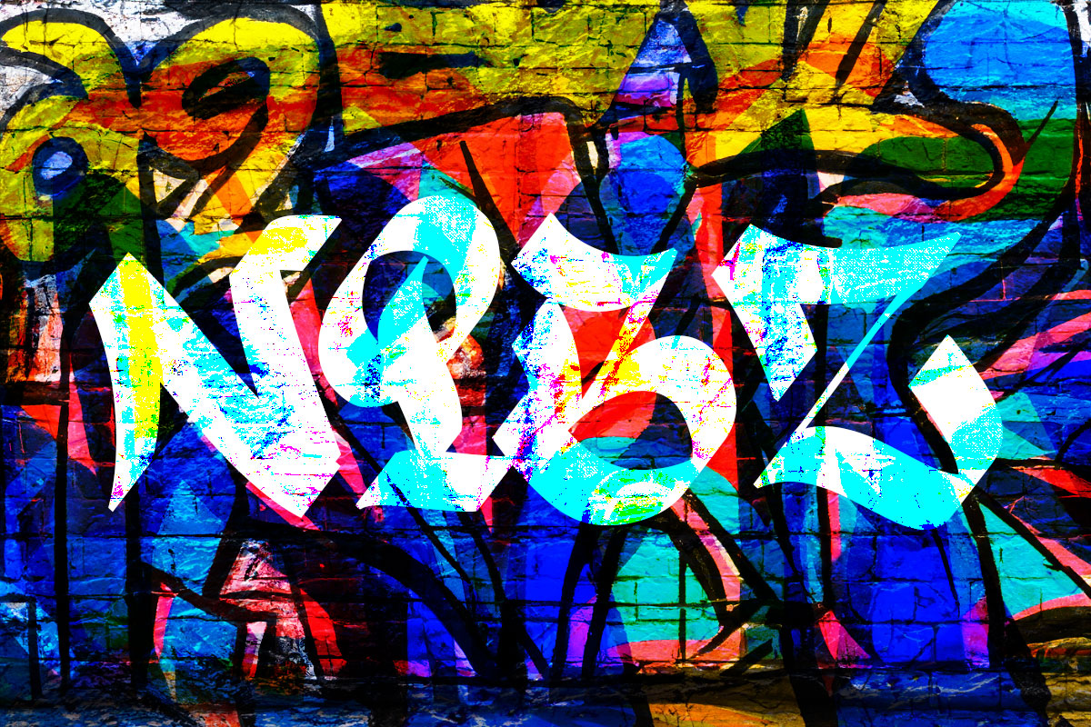
SPEL, a hip-hop inspired font I designed a while back
Download it here https://github.com/field2/fonts/blob/master/Spel-Regular.otf
-
How to frame paintings
E.G., a 30″ x 40″ painting: 1. Get your supplies at lowes or homedepot or…
-

Lichess Patron Icon
I probably am on lichess.org more than any other single website, mostly losing chess games.…