I made a font out of the icons I’m proposing for future versions of WordPress. Here’s how I did it:
Designed them in AI CS6. Preferences set like this:


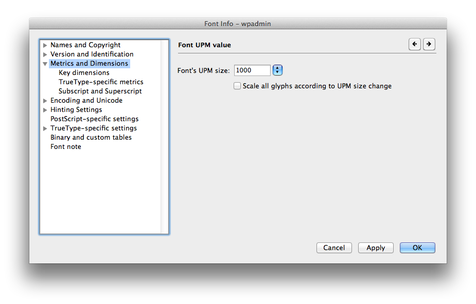
Then I created a new font in Fontlab 5, with metrics set like this:

I copy/pasted each icon-the shape and the invisible bounding box- into a separate glyph in fontlab. I tried to make it intuitive; “a” is appearance, “d” for dashboard. “p” was problematic; posts, pages both have p.
After I generated the otf file, I used @font-face to embed it on a test page. I set a base size to 62.5% and set the icons to 2.0em; effectively rendering them at their native 20×20 pixels. The key thing is the -webkit-font-smoothing:antialiased property in the css. Without it, they look like garbage. They pretty much look like garbage anyway in firefox/opera, and I have no clue how to get them in IE. But in webkit it’s gold.
I’m trying to get the whole thing on github since I guess that’s what you’re supposed to do, so stay tuned…