So I’m trying to see if it’s possible to use a font for icons on a site, as has been attempted by the likes of fontawesome and probably many others.
Prognosis to date: it doesn’t look good.
I drew a 16×16 pixel box in Illustrator CS6.
Copy/pasted it into the lower-case “a” glyph in Fontlab 5 (with metrics set to 800 upm).
Exported otf, css3’d it into a basic html file, typed a single “a” on the page, loaded the page in Chrome and Safari, and was disappointed.
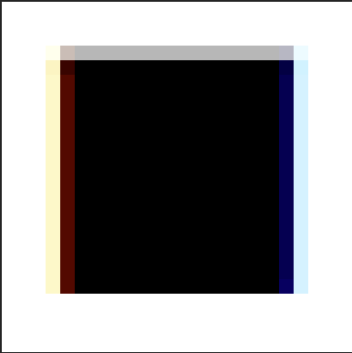
Here’s what I wanted to see: A perfect, 16×16 pixel black square, no anti-aliasing, in all major browsers.
Here’s what I got:


Those ain’t perfect squares. They’re close, and the main dark part of the square is 16x16px, but there’s some major anti-aliasing going on.
It’s also funny to note how Chrome tints the edges with a more reddish hue than safari.
I’ll keep playing around, but webfonts for iconography aren’t looking very promising, at least as long as low-dpi screens are around.
[UPDATE 1-26-13] I’ll post on the effects of webkit font smoothing shortly, how that impacts this experiment, and what it means for other browsers…