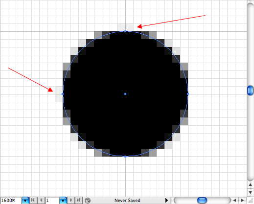
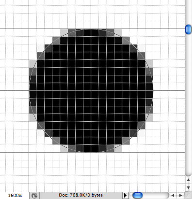
I’ve read (can’t think of where at the moment: UPDATE: Jonathan Hicks pimps fireworks here:http://hicksdesign.co.uk/journal/branding-firefox ) articles applauding the pixel preview functionality of AI, especially when it comes to designing low resolution icons. I investigated this a bit and here’s what I found:


Compare the above. Both are 16×16 pixel circles, but the Photoshop one is superior. Note how Illustrator adds grey pixels to the left and top of the icon. I’m not sure why it does this, maybe someone can explain, but for now I’m sticking with Photoshop for my icon design. Here they are at actual size:
![]()
![]()
Can you guess which one is which (hover over each for the answer). IMHO, the one on the right is better.