Category: Uncategorized
-
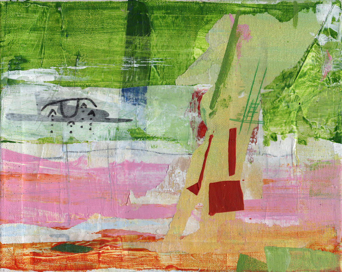
Contrast is the new context, which was the new content, which was the new format
In the beginning, format was king. The mere fact that we were reading something on the web made it important. It had somehow come to occupy this new medium, which in itself was novel and beautiful and confusing. Whoever put it there had to be smart, and therefore the content as well. Then, at some…
-
Newspaper
I don’t even know what that is I read something about a 20 million dollar loss Whose loss? How does one even lose 20 mill? I spend the next 20 minutes looking for a new car In the classifieds, and land on one like new Kelly green Olds, only 40k and just inspected I call…
-
Teaching
I’m a professor, which I suppose makes me a professional teacher. I instead like to think of myself as a professional learner. I believe that teaching is an extension of learning. It enhances learning. If I can teach you how to do something, it means I have learned it myself. There are other ways to…
-
How trees work
Looking out my window at the leaves that finally came in the last few weeks, and having played this video game Fortnight where you build shieldish fortresses, I can see that my tree building a shield so it can incubate things along its thick brown branches behind the green ruse we use, we and our…
-
Art as Anthropology part 1
I often think of Picasso’s famous quote, “Art is the sum of my destructions”. I’ve always gotten that. Whenever I make art, I feel like the second I’m close to that perfect line, shade, shape or texture, there’s all this pressure that I’m gonna fuck up. When that happens, I imagine a little Picasso sitting…
-
The Darkness
I recently read an article about someone who experienced trauma when they were very young, and how it manifested itself for the rest of his life as “the darkness”, a kind of demonic presence that was always looming. It was a very sad read. Though a very busy person, he found no joy in work,…
-
On Teaching
This spring, I’ll be teaching my age-old 2D Graphics course. Every time I teach it, I spend waaaaay too much time wondering what I should include in the course content. I change it every year. Adobe is the go-to graphics software company, and that hasn’t changed since they bought Macromedia long ago. I started off…
-
On light
We see because of light reacting with our crazy eyes and ocular nerves and brains. But there’s a lot to learn about where that light’s coming from. It’s either being emitted or reflected. The primary point of emitted light, for most of our existence on this planet, has been very hard, even dangerous, to look…
-
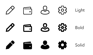
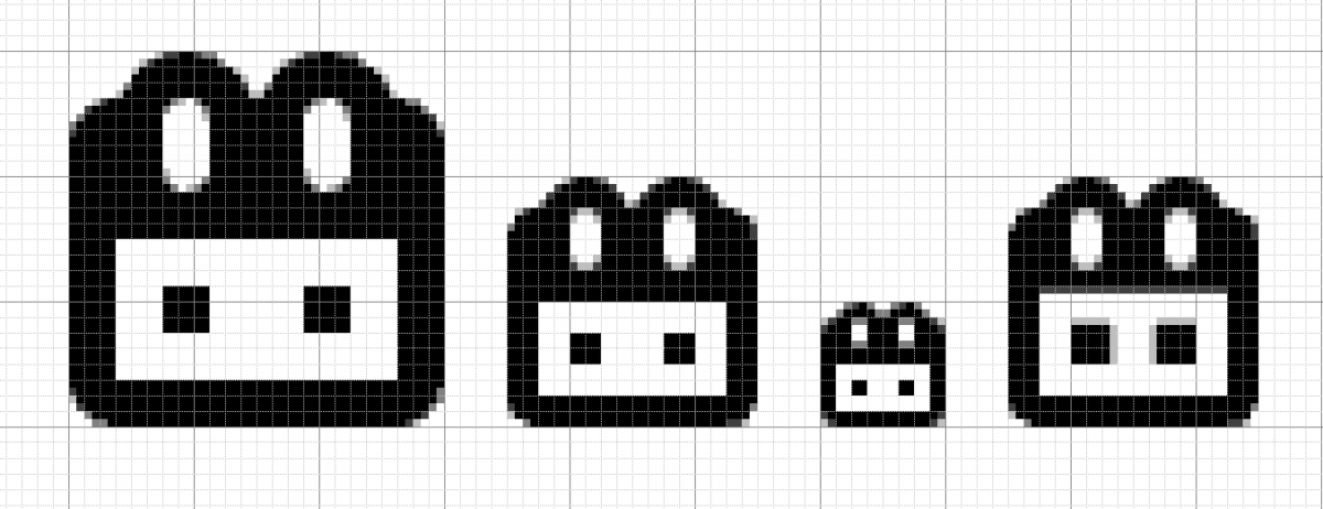
Multiple master icons
Just like fonts, icons can be designed in different weights. Here’s how it works in my current design, chubbicons: These are all rendered at 32×32. The bold weight was designed with 1 pixel wide stroke on a 9×9 grid, while the light weight was 1 pixel on an 18×18 grid. The solid is just…
-
Modes of Transportation series
I’m having fun with this theme. It makes it easy to think of things to make.
-
A standard for user interface icon design
Editing this article to discuss general icon design standards, which I believe are needed. Icons should down-rez gracefully to small sizes, with vertical and horizontal edges aligning to the pixel grid at sizes as small as 9 pixels. A 3×3 sub grid should be adhered to when designing icons. [codepen_embed height=”265″ theme_id=”1″ slug_hash=”EvqZQZ” default_tab=”html,result” user=”empireoflight”]See…
-
Cooper Union
As soon as I was considering life after high school, I had my heart set on Cooper Union. I wanted to make “cool looking shit”, I was good at it and CU was where the best in the world did it. Plus it was in Manhattan, my favorite place in the world and a 45…
-
Had to be the most beautiful day
Went up to Canada with Nancy and her friend. Stopped at the grocery, got the guac stuff and some burger meat.Chased a few house wrens away. Cleaned the cottage up while the girls made guac. Went surfing at Pleasant, watched Nan and her bud get sweet rides. Got a ticket there and almost towed but…
-
Sketch
I have the app, I’ve played with it, made some icons, and I still don’t get it. I think folks who use it a lot aren’t fluent html/css coders. For me, it’s a lot easier to do the things people say Sketch shines at directly in code. Do you use Sketch? Do you consider yourself a…