Author: Ben
-

NEA logo entry
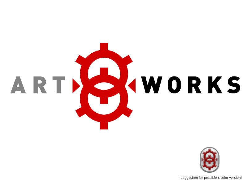
So last month I spent a bunch of time working on a logo design in response to Uncle Sam’s RFP: http://artsbeat.blogs.nytimes.com/2010/02/01/wholl-design-the-new-nea-logo-it-could-be-you/ . Regardless of what I think of spec work, I love high scale design competitions. Too much design is born from who-you-know and schmoozing. Here’s my submission:
-
The mccondo
I’m at the ft Erie town meeting and 2 hours into it were hearing the same pro-condo heads go on and on. Were all in agreement on this point- the town needs more people, more business. The people you’re gonna get are not what you want. You want people to fix the cottages and build…
-
Futura vs. Verdana
OK all you typography snobs out there, up in arms over Ikea’s recent switch to Verdana (google ikea verdana), ask yourselves: If you had one store to shop for all of your furniture, what would it be? Ikea, right. If you had one font to use on everything you designed, what would it be? Well,…
-
Bang Bang You're Dead
I want this book: http://bit.ly/2dwULc The kids basically maul each other in a war. This would make such a better movie than “Where the Wild Things Are”.
-
Things are better for my kids
A theme you hear is how parents want to make sure their kids have all the things they didn’t. I don’t get that. I had everything; my parents gave us lots of toys and good food and everything. Maybe it was being a child of the 70s/80s, when things were pretty plentiful. Today I was…
-

Gallery 3 icons
I’ve been working on icons for the upcoming release of Gallery 3 (http://gallery.menalto.com/). Here they are:
-
A good beach day
Well there’s nothing like spending a 90º summer afternoon in a cool lake with your three kids, all under the age of 12 mind you (that’s key), wrestling and throwing them around in the waves, with high winds whipping up one-footers. Of course it ain’t the Atlantic, but whatryagonnado. We followed it up with some…
-
Wordcamp Buffalo?
Thinking about trying to organize a Wordcamp in Buffalo some time next Spring. Anyone interested in helping out? I need to find sponsors, venue, speakers, etc. Not sure I want to get into unless I have some people backing me up!
-
Coconut Shrimp Recipe
I been working on my coconut shrimp: 1 pack 25-35 frozen shrimp, e-z-peel®™© 2 tb Flour/2 tsp Old Bay mixed together in a bowl 1 Lime Handful Sweet Shredded Coconut Handful Bread Crumbs pinch red hot pepper flakes 1/4 cup Milk/cream 2 eggs 2 tbsp Mayonnaise 3 tbsp Orange Marmalade Throw frozen shrimp in some…
-
Icons
New work–all are 6″x4″ drypoint/monoprint, unframed. Let me know if you want one! [nggallery id=1]
-
Sample icon file for wordpress plugins
icon_effect.zip You can download this file and use it as a starting point when designing plugin icons, so that they resemble the default set in WordPress’ admin area. Copy and paste the effect applied to the rounded rectangle shape to your own vector shape in Photoshop.
-
Sf moma
At the Okeefe /Adams special exhibit. Pretty stuff, unfortunately though okeefe spawned hoards of lousy imitators. Can’t wait to see the general collection.
-
Looking for the ultimate makhani sauce recipe
I seriously believe Makhani sauce is the best stuff you can eat on this planet. But it is incredibly hard to make. At least, that’s been my impression to date. I spent an afternoon constructing something verbatum from some website, and it sucked so bad I tossed the entire batch. So I’m done trying to…
-
Quick and Easy Recipe #2-get the kids back in school
I borrowed heavily from a link my Brother sent me for this one: http://www.nytimes.com/2009/03/25/dining/25mini.html?ref=dining but when I tried it on the kids recently they gagged. Soon after they all got sick, really sick, and have stayed home from school most of this week. So I tried it again with different ingredients: 3 bullion cubes (Beef,…
-

Comment icons
OK, dilemma here. Does the pointy part of a comment bubble icon face left or right? Consider: versus: so, which one says “Comments” more directly? To clarify, here’s the one in the WordPress admin (I designed it): And here’s the one on digg.com: I kinda wish now that I had made the point face left,…
-
Quick and easy Buffalo Chicken Pizza
I’ll post my favorite quick and easy recipes as I think of them. I’ve had enough with long winded, 3 dozen ingredient jpbs-I never make them right. Either I’m too lazy or not a very talented cook (probably co-dependent factors there), but I’ve wasted too much time and money on busted meals. This one is…
-
Notes from sabbatical
Been to the studio twice, have four plates ready to proof. Friday is working out to be the best day in terms of free time, so I should have some stuff ready by end of this week. Built a bunch of icons in photoshop, just b/w now, will try to export to C4D and see…
