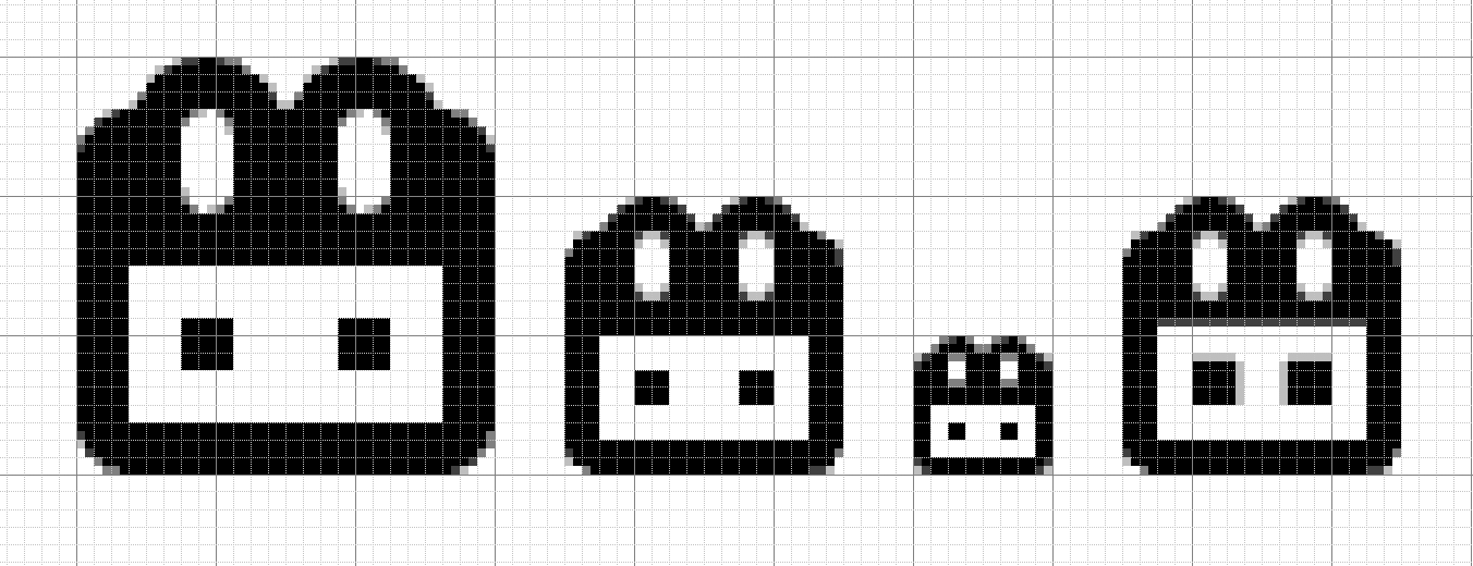
Editing this article to discuss general icon design standards, which I believe are needed. Icons should down-rez gracefully to small sizes, with vertical and horizontal edges aligning to the pixel grid at sizes as small as 9 pixels. A 3×3 sub grid should be adhered to when designing icons.
[codepen_embed height=”265″ theme_id=”1″ slug_hash=”EvqZQZ” default_tab=”html,result” user=”empireoflight”]See the Pen <a href=’https://codepen.io/empireoflight/pen/EvqZQZ/’>base-8 grid icons</a> by Ben Dunkle (<a href=’https://codepen.io/empireoflight’>@empireoflight</a>) on <a href=’https://codepen.io’>CodePen</a>.[/codepen_embed]
As you can see in the last icon, the 3×3 subgrid isn’t honored and some edges get blurry:
