The dashicons font created for the mp6 plugin has pretty much taken up all of my time the last few weeks. This even with help from Mel Choyce, Joen Asmussen and the rest of the WP design team.
There are quite a few resources on how to do this, but most of the ones I’ve read, although I’m sure worked for some, went against a few of my own design principals. So I set out to find the perfect workflow for me, and here it is.
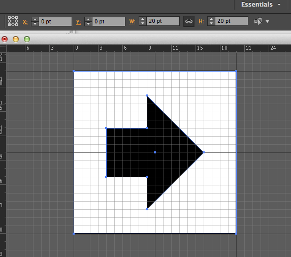
When I design icons in Photoshop (AP), the end goal is a png sprite. Using a split window, I can zoom in on one window and see the actual size icon in the other. I can click on an anchor point and nudge it with the arrow keys, getting sub-pixel placement just right and having absolute control over the end product.
The move to vector as the final source has been really weird and challenging. In Illustrator, vectors don’t anti-alias the same was as they do in Photoshop. That is, if you draw a rectangle with the edges half-way between the edges of a pixel, in Photoshop, you might get a different grey value than if you did that in Illustrator (AI). And pixel snapping is inconsistent. I would copy/paste a shape from AP to AI, and my perfectly sharp edges would become fuzzy, even though the paths were exactly in the same place. If I click/dragged an anchor over a pixel, then dragged it back, it would become sharp again. Very weird.
The tutorials I read through, https://github.com/blog/1135-the-making-of-octicons and http://glyphsapp.com/blog/importing-from-illustrator/ were really helpful, but as I said earlier, there are fundamental flaws with those workflows, at least as far as I’m able to incorporate them into mine. For some reason, 16×16 is this imposing number that icon designers hold sacred. It’s a good target, but it really does overly constrain design. I decided 20×20 was a much easier canvas to work within, and as long as I left a pixel or two breathing room around the icons, they look great in a 16×16 space-not too big, but not leaving out important details in the name of absolute limits. I also got nervous when scanning through the article at all the weird numbers: 2048, 2052, -17something. Do we really need all those complex numbers? As for the glyphsapp.com article, while trying to draw directly in Glyphs may be the best way, it’s gonna be tough to put aside my AI experience to learn a new method for drawing vectors until I have lots of time on my hands.
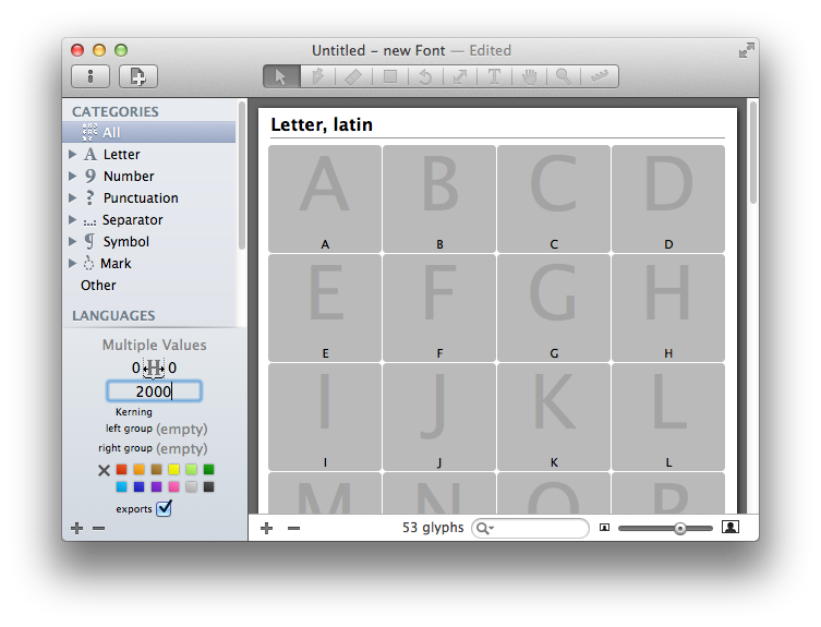
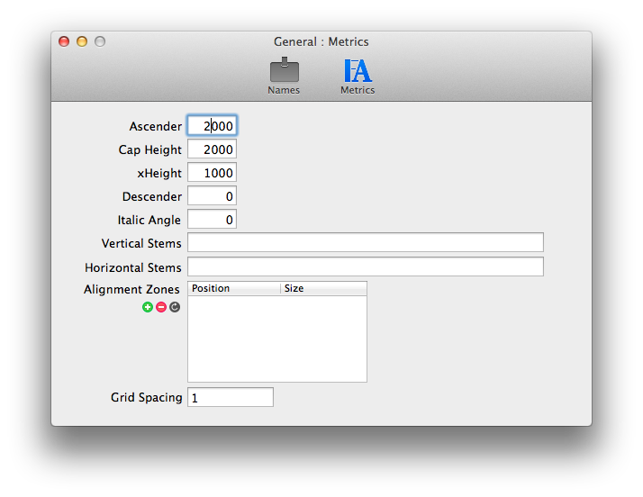
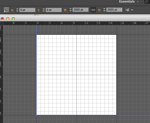
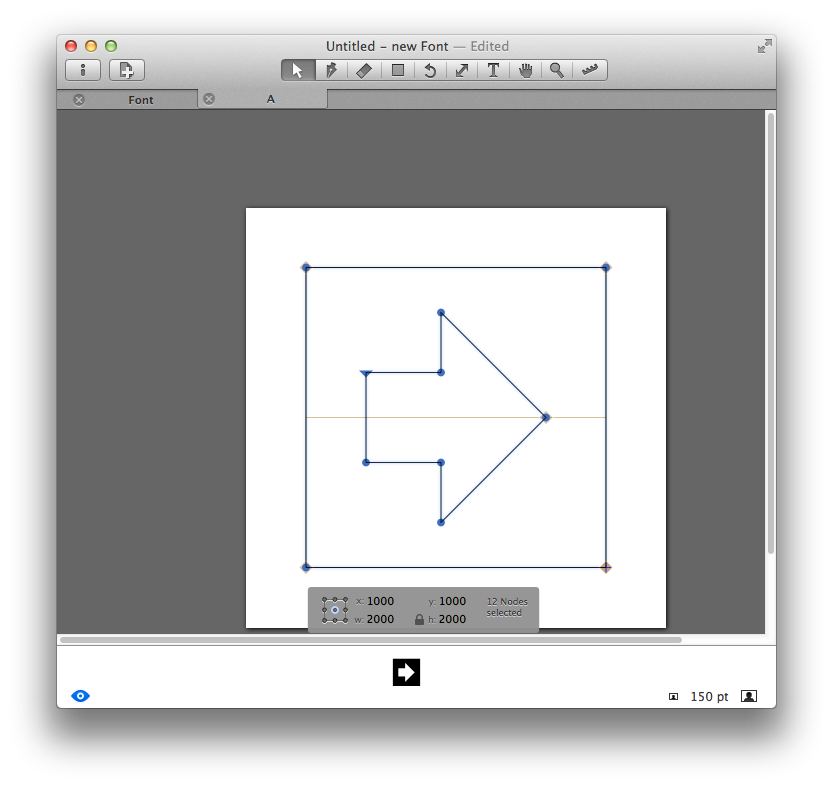
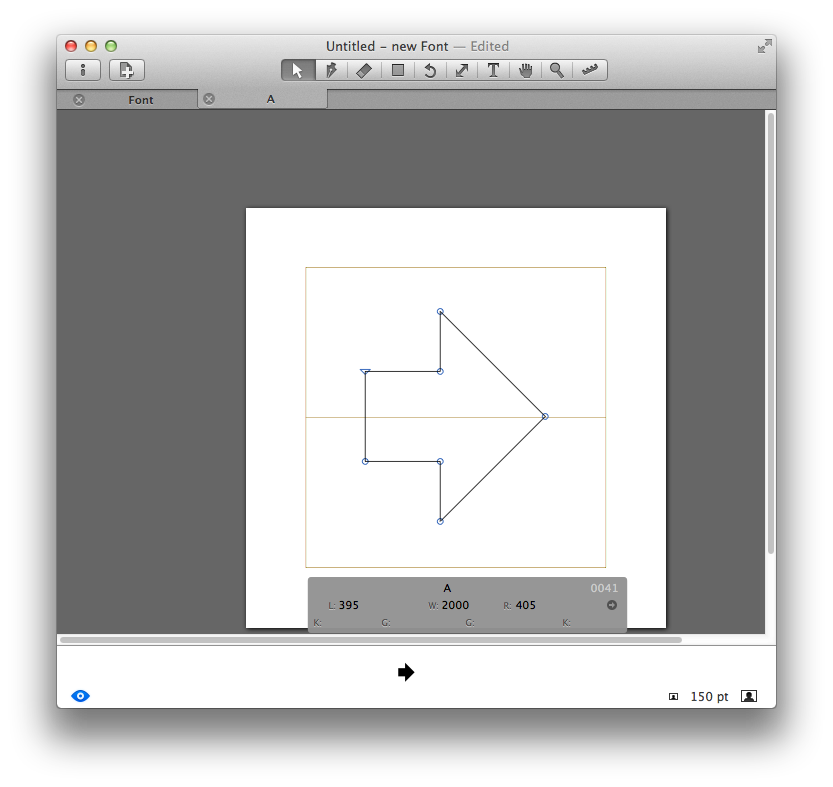
After trying all sorts of settings, I came to the conclusion that 20x20pixel icons should be designed in a 2000×2000 upm font. The glyphs article points out that 1 ai point=1 glyphs unit. So I worked in points.
Another oddity was the Glyphs vs Glyphs Mini (GM) inconstancies. Joen Asmussen, who I can’t thank enough for all his help on this, designed the icon font you see at WordPress.com, using GM and following the octicons article pretty closely. I had a trial version of Glyphs, but decided to spring for GM for the sake of consistency. Although I started the font in Glyphs, bringing it into GM was an eye opener. The major issue was that GM doesn’t allow you to change the font’s UPM settings; so when I opened the .glyphs file I created in Glyphs, I was stuck with the 1000 upm I was originally working with. When I decided to try 2000 upm, so that it mapped more (theoretically) naturally with the 20pt x 20pt AI designs, my glyphs all got cut to 50% of their size. Resizing in glyphs was not something I wanted to learn how to do, so I returned my workflow to Glyphs.
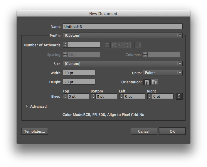
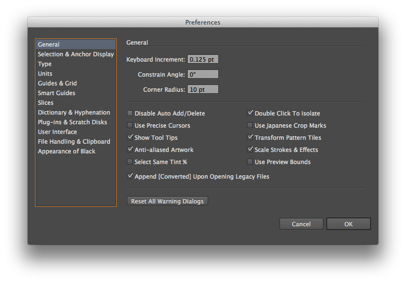
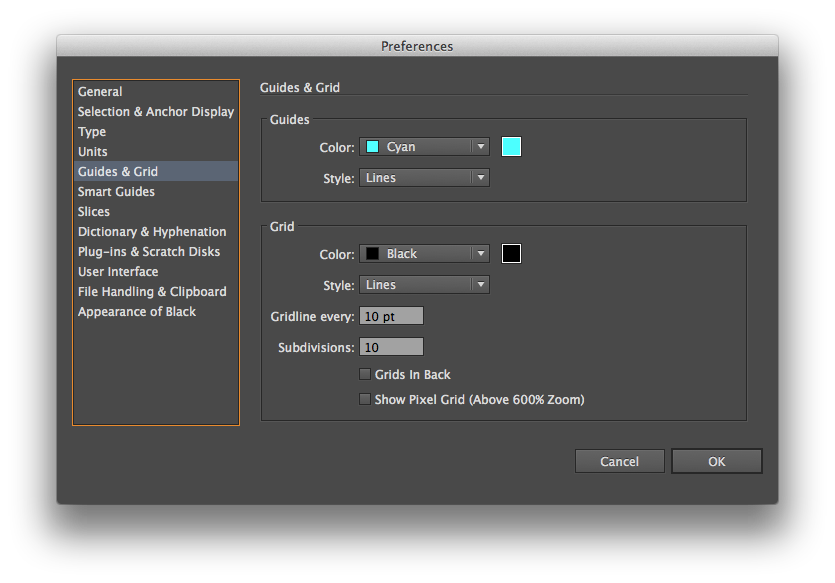
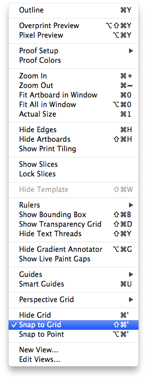
Screenshots:
You can download the glyphs file, AI source file, and .otf here. Stay tuned for a video post.